Instagram Add Yours
This project is under NDA
Enter the password to view this case study
Incorrect password — try again
Content design
Overview
Add Yours is an Instagram sticker that lets users respond to prompts by adding their own media—a social chain reaction. The feature had launched but wasn't gaining traction.
Problem
Usage was below projections. Users couldn't easily discover existing prompts, and the only entry point was stumbling onto one in Stories—a passive, low-intent path.
Goal
Increase engagement by creating new discovery surfaces—a dedicated page, story entry points, and push notifications—while clearly communicating visibility and privacy.
Users could add an Add Yours sticker to a video or image (Frames 1-2), write a prompt (Frames 3-4), and then add it to their story (Frame 5). At the time, the only way to access another Add Yours prompt was to stumble upon it while viewing a story from another user.
Frame 1
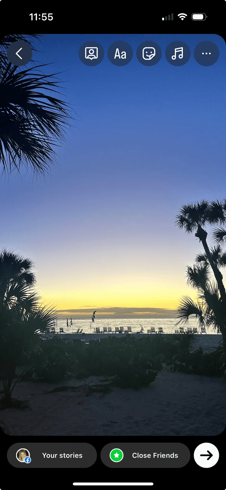
The user selects an image or video for their story.
Frame 2
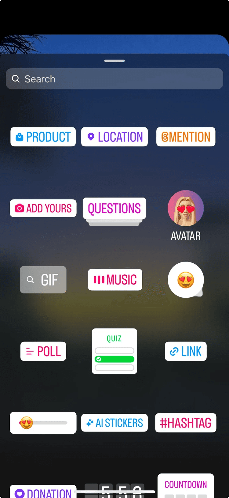
To add a new sticker, they select the sticker tab and select ADD YOURS.
Frame 3
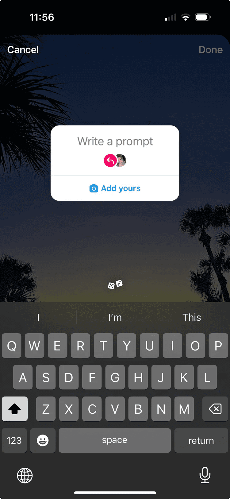
The user can then enter their own prompt.
Frame 4
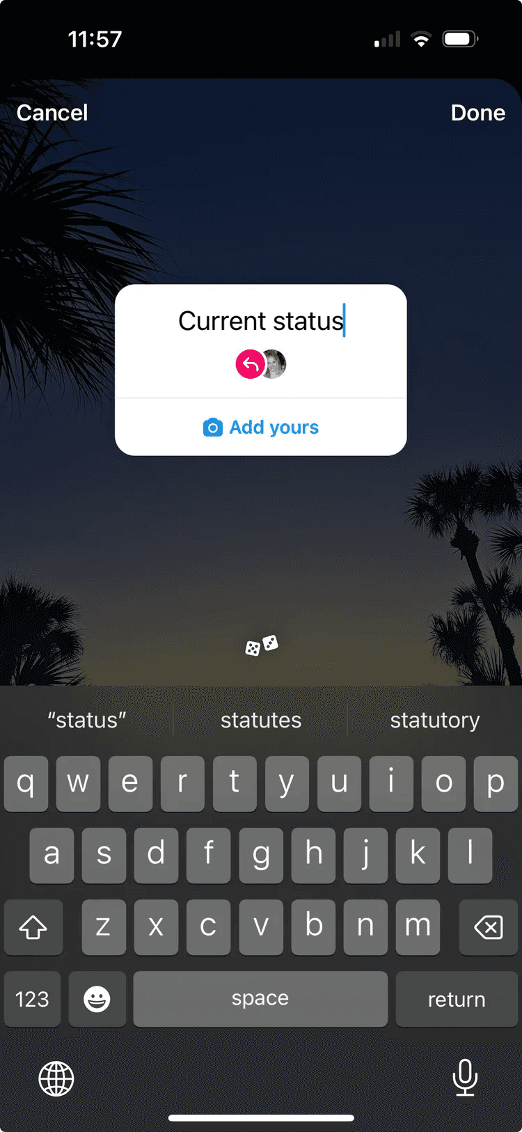
Once the user enters their prompt, they select Done before adding to their story.
Frame 5
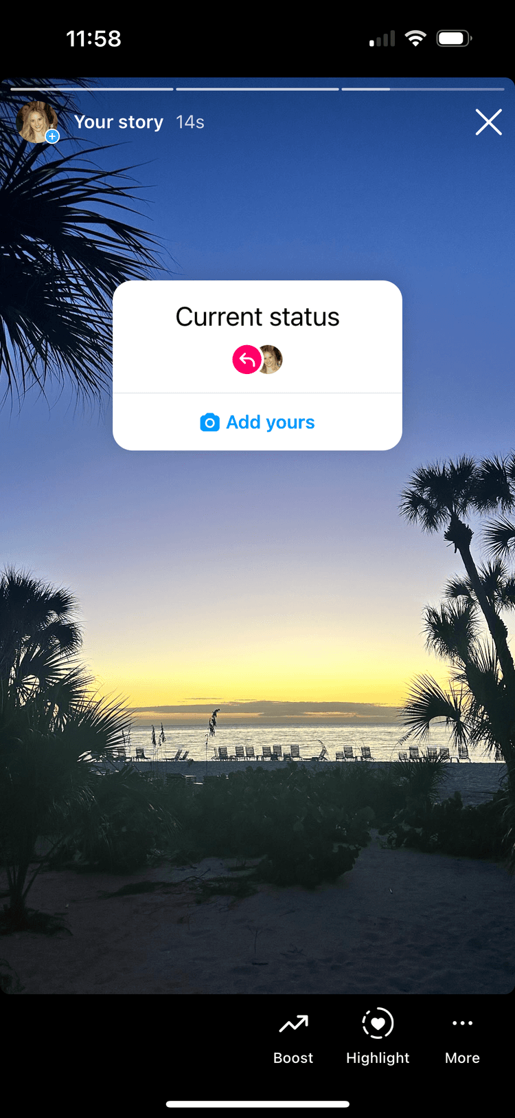
Another user can view the story and add to the prompt by tapping the 'Add yours' button.
Frame 6
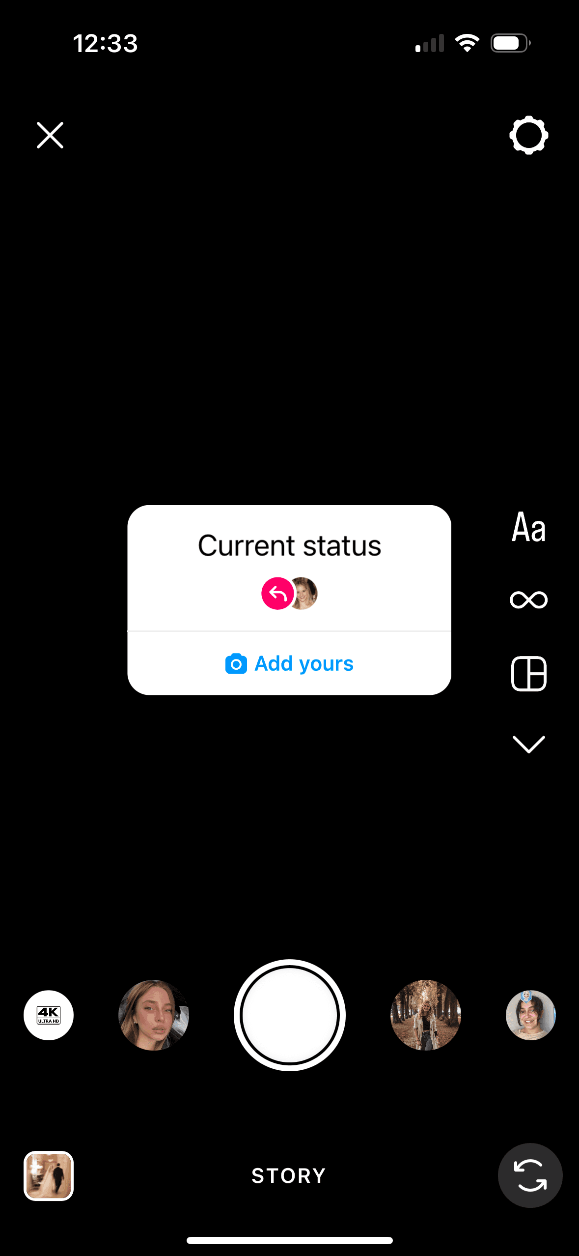
They can create a story by adding media and post to their story.
Process
Audited the existing flow with product stakeholders and identified the core friction: users had no way to browse or search prompts.
Partnered with UX research to understand what motivates people to participate—and what holds them back (primarily visibility concerns).
Designed high-fidelity wireframes for an Add Yours discovery page, story sticker variants, and push notification copy.
Aligned with legal on disclosure language—users needed to understand exactly who could see their response before committing.
A/B tested three sticker display variants, three visibility disclosures, and three push notification variants to optimize for clarity and engagement.
Design
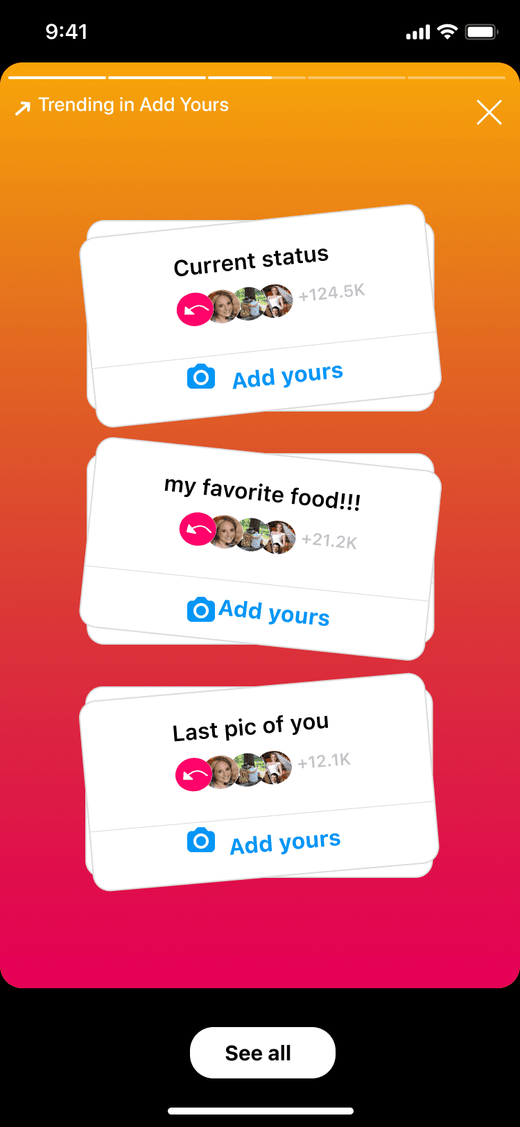
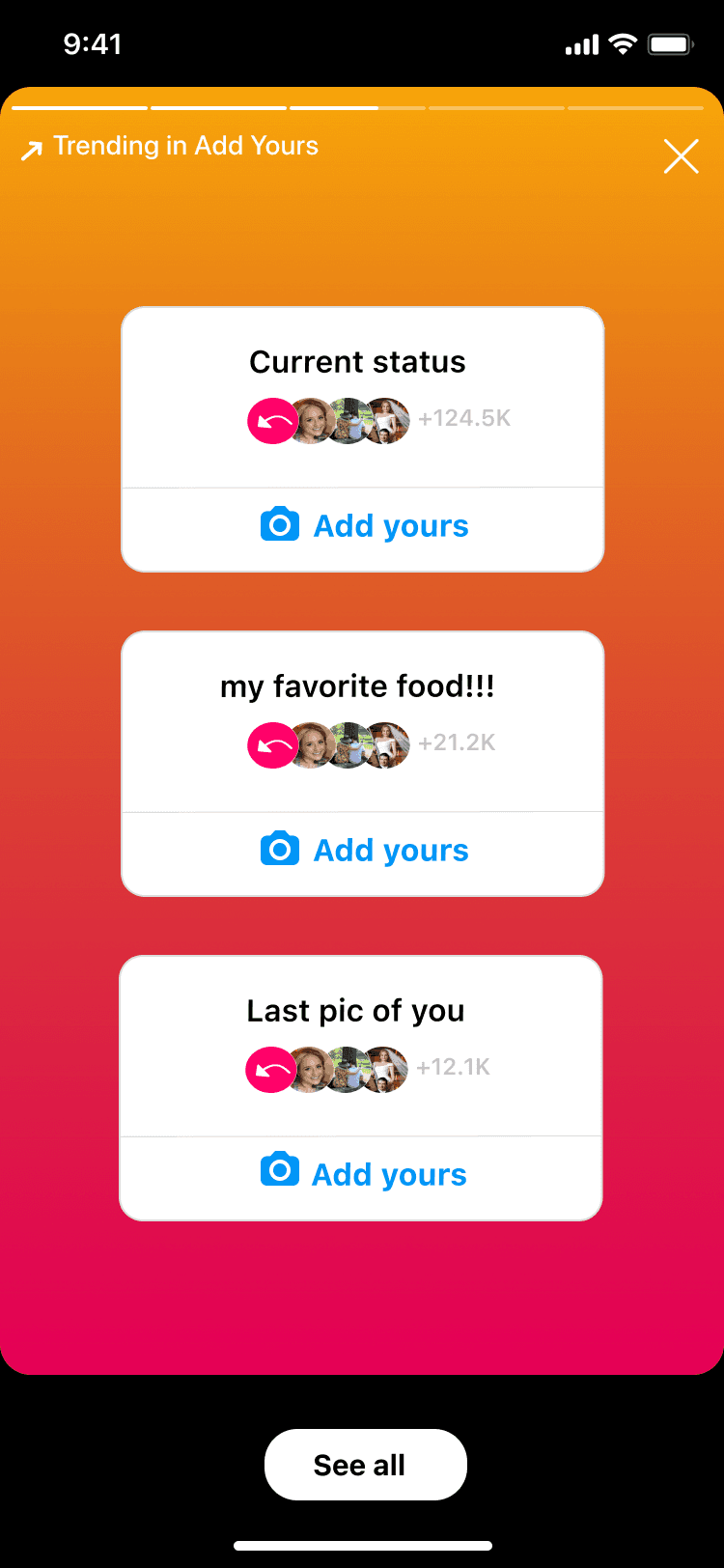
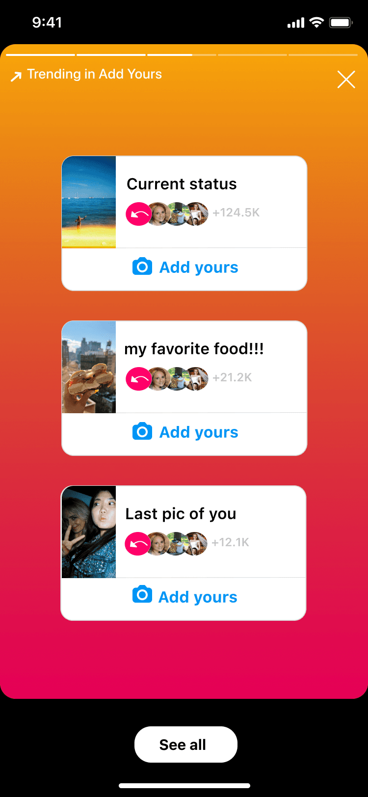
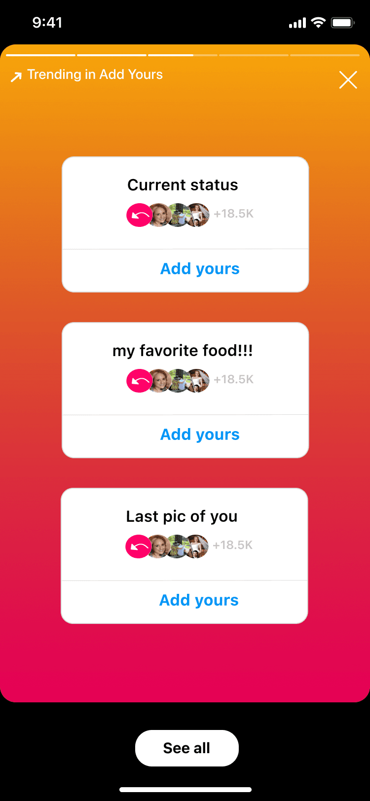
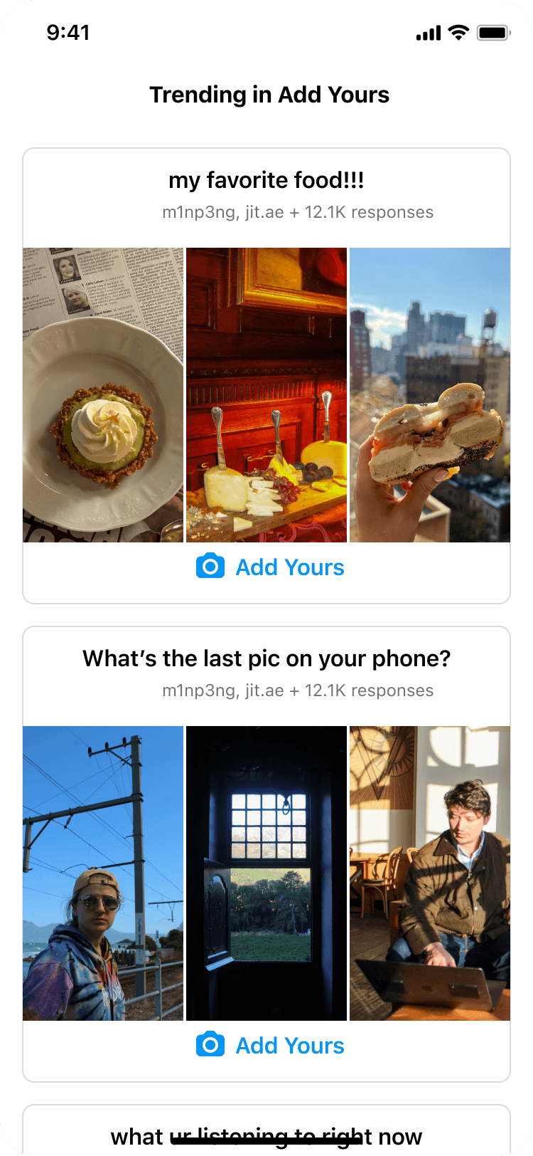
Research revealed that users engage with Add Yours when they see familiar faces, not generic trending content. With that in mind, we tested three sticker display variants to find the right balance of social proof and discoverability.
Variant 1
Variant 2
Variant 3
All variants allow users to select:
• See all to view the Add Yours discovery page
• People they follow—who contributed—below the prompt
• Add yours to create their own story with the prompt
Upon testing, users more frequently engaged with previews that do not include media. Additionally, the first variation had a higher engagement rate. For the flow, we first wanted users to see trending prompts.
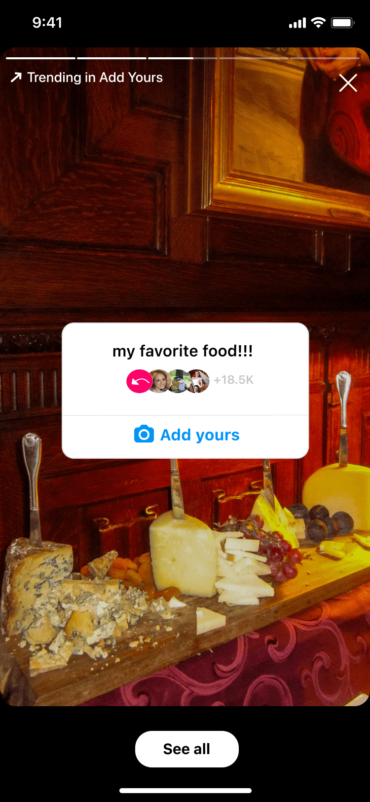
Users preferred the second variant, which we used as the entry point (Frame 1) to the flow.
Frame 1
The user sees a story with three trending prompts their friends have contributed to.
Frame 2
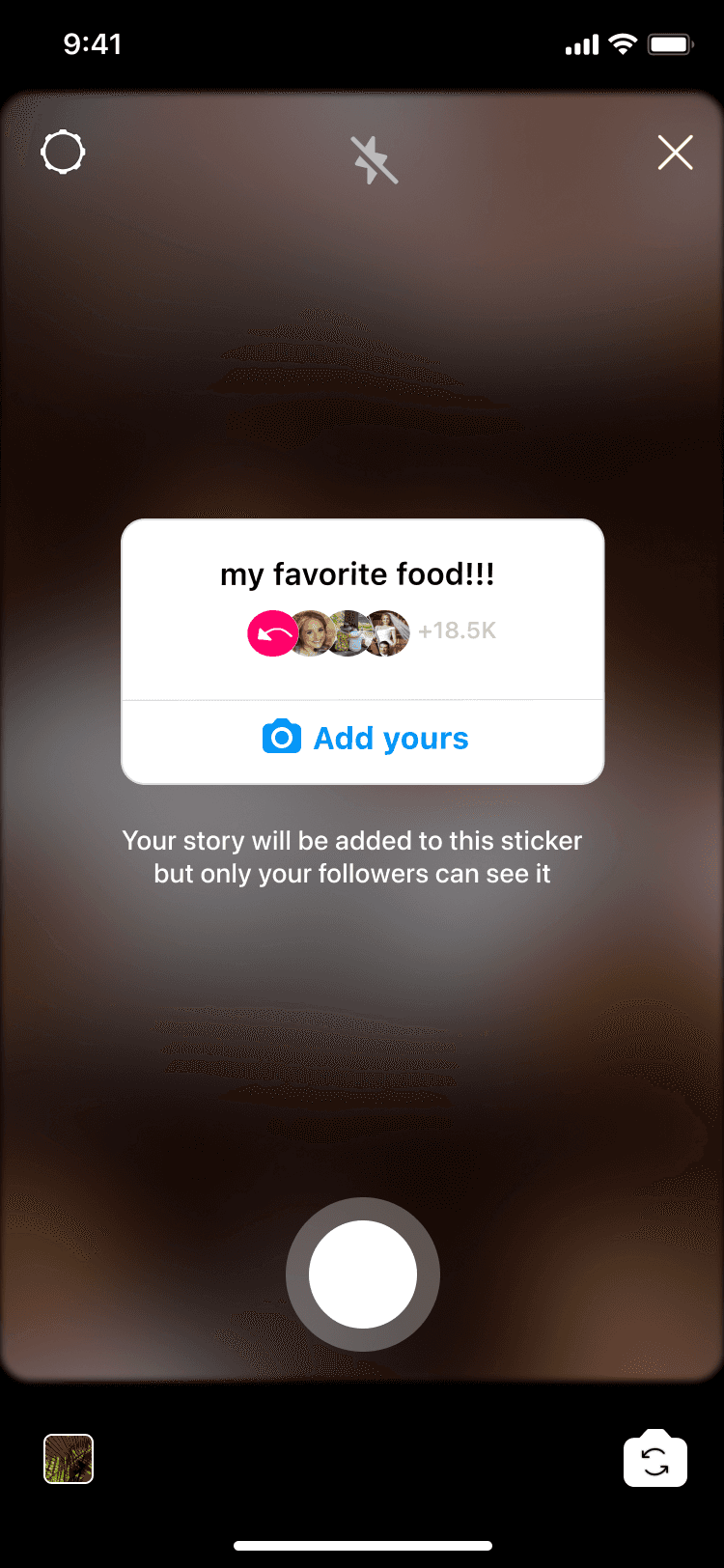
The user can respond by tapping one of the Add yours button in Frame 1.
Frame 3
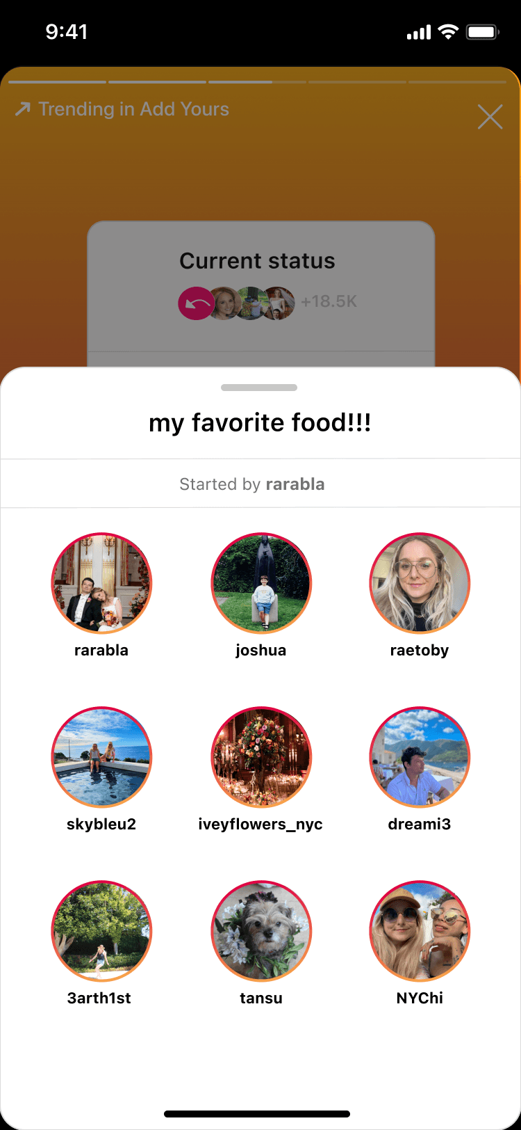
The user can tap a prompt in Frame 1 to see who responded to a prompt.
Frame 4
If a user selects See all in Frame 1, they're taken to the discovery page.
Frame 5
The user can tap and view a story response from Frames 3 and 4.
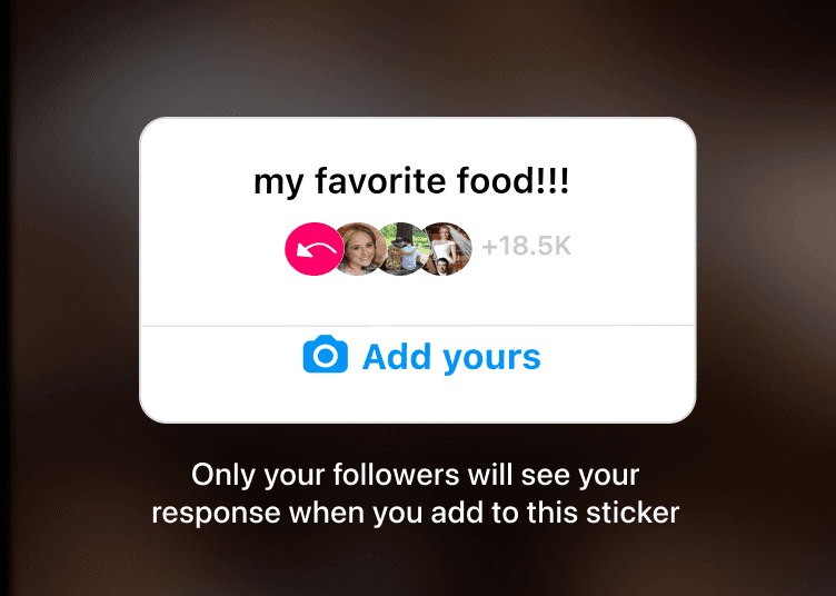
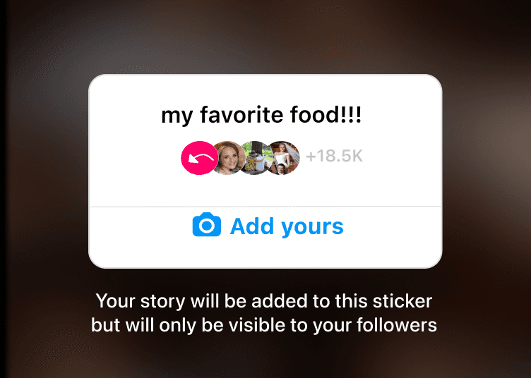
The critical content design challenge: users needed to understand visibility before committing. If they add to a prompt, their story is visible to the sticker creator and other participants. We tested three disclosure approaches—balancing legal clarity with engagement.
Variant 1

Users shown this version were able to accurately explain their story visibility and what would happen if they add their story to the sticker.
Variant 2
Some users were confused as to how this was different from their current privacy settings.
Variant 3
This version is wordier and more confusing than the first variant.
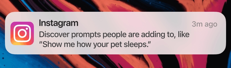
To drive discovery beyond Stories, we designed a mobile push notification. I created three variants—testing whether social proof, personalization, or FOMO language drove the highest open rates—and A/B tested with real users.
Variant 1
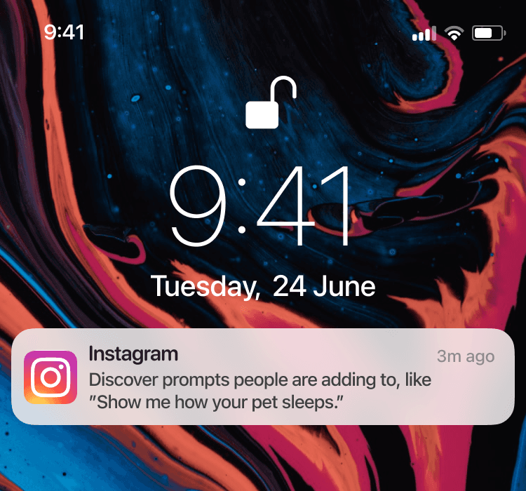
Notifications.
Variant 2
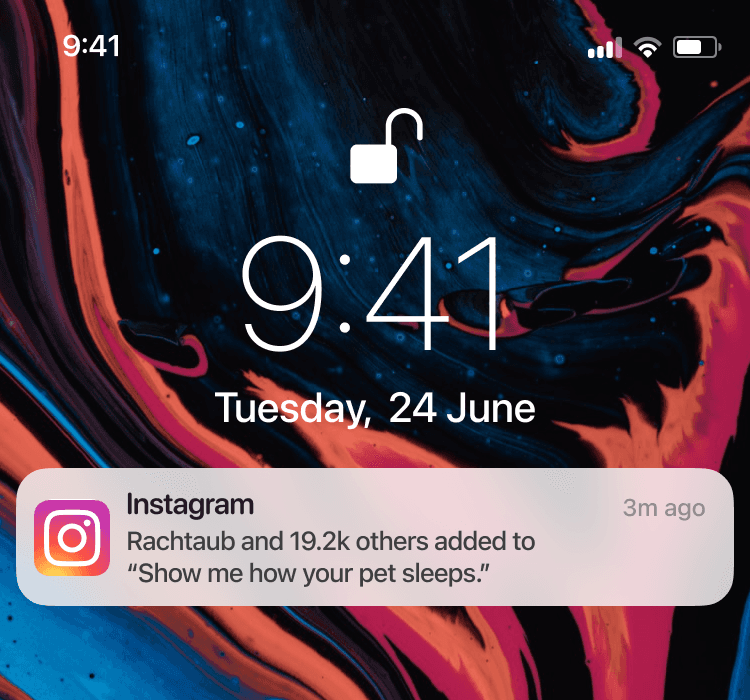
Factoid and 15.2k others added to "Show me how your pet sleeps". The open rate was 6%.
Variant 3

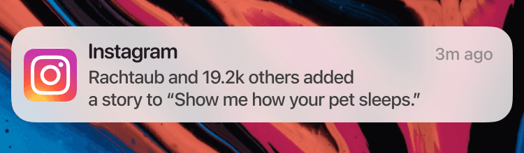
A story to "Show me how your pet sleeps". rate 3%.
Users were more likely to open the notification when it referenced someone they follow—confirming the social proof hypothesis across surfaces.
Results
Sticker display: Variants with media previews drove 2–3x higher engagement than text-only previews. Variants 1 and 2 achieved 6% and 4% engagement vs. 2% for Variant 3.
Visibility disclosure: Variant 3 slightly outperformed Variant 1 on engagement, but qualitative follow-ups showed Variant 1 was perceived as more trustworthy and informative—a tradeoff we flagged for the team.
Push notifications: Variant 2 achieved 6% open rate vs. 1–3% for others. The winning pattern: showing who in your network had already responded.
Takeaways
Social proof was the unlock. People engage when they see someone they follow already participated—not when they see a generic trending prompt.
Quantitative A/B results don't always tell the full story. Variant 1's disclosure tested lower on engagement but higher on trust in interviews—the kind of nuance that only surfaces with mixed-method research.
Discovery was the real barrier, not interest. Once we gave users a way to browse prompts, engagement followed.
Instagram Add Yours
Content design
Overview
Add Yours is an Instagram sticker that lets users respond to prompts by adding their own media—a social chain reaction. The feature had launched but wasn't gaining traction.
Problem
Usage was below projections. Users couldn't easily discover existing prompts, and the only entry point was stumbling onto one in Stories—a passive, low-intent path.
Goal
Increase engagement by creating new discovery surfaces—a dedicated page, story entry points, and push notifications—while clearly communicating visibility and privacy.
Users could add an Add Yours sticker to a video or image (Frames 1-2), write a prompt (Frames 3-4), and then add it to their story (Frame 5). At the time, the only way to access another Add Yours prompt was to stumble upon it while viewing a story from another user.
Frame 1
The user selects an image or video for their story.
Frame 2
To add a new sticker, they select the sticker tab and select ADD YOURS.
Frame 3
The user can then enter their own prompt.
Frame 4
Once the user enters their prompt, they select Done before adding to their story.
Frame 5
Another user can view the story and add to the prompt by tapping the 'Add yours' button.
Frame 6
They can create a story by adding media and post to their story.
Process
Audited the existing flow with product stakeholders and identified the core friction: users had no way to browse or search prompts.
Partnered with UX research to understand what motivates people to participate—and what holds them back (primarily visibility concerns).
Designed high-fidelity wireframes for an Add Yours discovery page, story sticker variants, and push notification copy.
Aligned with legal on disclosure language—users needed to understand exactly who could see their response before committing.
A/B tested three sticker display variants, three visibility disclosures, and three push notification variants to optimize for clarity and engagement.
Design
Research revealed that users engage with Add Yours when they see familiar faces, not generic trending content. With that in mind, we tested three sticker display variants to find the right balance of social proof and discoverability.
Variant 1
Variant 2
Variant 3
All variants allow users to select:
• See all to view the Add Yours discovery page
• People they follow—who contributed—below the prompt
• Add yours to create their own story with the prompt
Upon testing, users more frequently engaged with previews that do not include media. Additionally, the first variation had a higher engagement rate. For the flow, we first wanted users to see trending prompts.
Users preferred the second variant, which we used as the entry point (Frame 1) to the flow.
Frame 1
The user sees a story with three trending prompts their friends have contributed to.
Frame 2
The user can respond by tapping one of the Add yours button in Frame 1.
Frame 3
The user can tap a prompt in Frame 1 to see who responded to a prompt.
Frame 4
If a user selects See all in Frame 1, they're taken to the discovery page.
Frame 5
The user can tap and view a story response from Frames 3 and 4.
The critical content design challenge: users needed to understand visibility before committing. If they add to a prompt, their story is visible to the sticker creator and other participants. We tested three disclosure approaches—balancing legal clarity with engagement.
Variant 1
Users shown this version were able to accurately explain their story visibility and what would happen if they add their story to the sticker.
Variant 2
Some users were confused as to how this was different from their current privacy settings.
Variant 3
This version is wordier and more confusing than the first variant.
To drive discovery beyond Stories, we designed a mobile push notification. I created three variants—testing whether social proof, personalization, or FOMO language drove the highest open rates—and A/B tested with real users.
Variant 1
Notifications.
Variant 2

Factoid and 15.2k others added to "Show me how your pet sleeps". The open rate was 6%.
Variant 3
A story to "Show me how your pet sleeps". rate 3%.
Users were more likely to open the notification when it referenced someone they follow—confirming the social proof hypothesis across surfaces.
Results
Sticker display: Variants with media previews drove 2–3x higher engagement than text-only previews. Variants 1 and 2 achieved 6% and 4% engagement vs. 2% for Variant 3.
Visibility disclosure: Variant 3 slightly outperformed Variant 1 on engagement, but qualitative follow-ups showed Variant 1 was perceived as more trustworthy and informative—a tradeoff we flagged for the team.
Push notifications: Variant 2 achieved 6% open rate vs. 1–3% for others. The winning pattern: showing who in your network had already responded.
Takeaways
Social proof was the unlock. People engage when they see someone they follow already participated—not when they see a generic trending prompt.
Quantitative A/B results don't always tell the full story. Variant 1's disclosure tested lower on engagement but higher on trust in interviews—the kind of nuance that only surfaces with mixed-method research.
Discovery was the real barrier, not interest. Once we gave users a way to browse prompts, engagement followed.
Instagram Add Yours
Content design
Overview
Add Yours is an Instagram sticker that lets users respond to prompts by adding their own media—a social chain reaction. The feature had launched but wasn't gaining traction.
Problem
Usage was below projections. Users couldn't easily discover existing prompts, and the only entry point was stumbling onto one in Stories—a passive, low-intent path.
Goal
Increase engagement by creating new discovery surfaces—a dedicated page, story entry points, and push notifications—while clearly communicating visibility and privacy.
Users could add an Add Yours sticker to a video or image (Frames 1-2), write a prompt (Frames 3-4), and then add it to their story (Frame 5). At the time, the only way to access another Add Yours prompt was to stumble upon it while viewing a story from another user.
Frame 1
The user selects an image or video for their story.
Frame 2
To add a new sticker, they select the sticker tab and select ADD YOURS.
Frame 3
The user can then enter their own prompt.
Frame 4
Once the user enters their prompt, they select Done before adding to their story.
Frame 5
Another user can view the story and add to the prompt by tapping the 'Add yours' button.
Frame 6
They can create a story by adding media and post to their story.
Process
Audited the existing flow with product stakeholders and identified the core friction: users had no way to browse or search prompts.
Partnered with UX research to understand what motivates people to participate—and what holds them back (primarily visibility concerns).
Designed high-fidelity wireframes for an Add Yours discovery page, story sticker variants, and push notification copy.
Aligned with legal on disclosure language—users needed to understand exactly who could see their response before committing.
A/B tested three sticker display variants, three visibility disclosures, and three push notification variants to optimize for clarity and engagement.
Design
Research revealed that users engage with Add Yours when they see familiar faces, not generic trending content. With that in mind, we tested three sticker display variants to find the right balance of social proof and discoverability.
Variant 1
Variant 2
Variant 3
All variants allow users to select:
• See all to view the Add Yours discovery page
• People they follow—who contributed—below the prompt
• Add yours to create their own story with the prompt
Upon testing, users more frequently engaged with previews that do not include media. Additionally, the first variation had a higher engagement rate. For the flow, we first wanted users to see trending prompts.
Users preferred the second variant, which we used as the entry point (Frame 1) to the flow.
Frame 1
The user sees a story with three trending prompts their friends have contributed to.
Frame 2
The user can respond by tapping one of the Add yours button in Frame 1.
Frame 3
The user can tap a prompt in Frame 1 to see who responded to a prompt.
Frame 4
If a user selects See all in Frame 1, they're taken to the discovery page.
Frame 5
The user can tap and view a story response from Frames 3 and 4.
The critical content design challenge: users needed to understand visibility before committing. If they add to a prompt, their story is visible to the sticker creator and other participants.
We tested three disclosure approaches—balancing legal clarity with engagement.
Variant 1
Users shown this version were able to accurately explain their story visibility and what would happen if they add their story to the sticker.
Variant 2
Some users were confused as to how this was different from their current privacy settings.
Variant 3
This version is wordier and more confusing than the first variant.
To drive discovery beyond Stories, we designed a mobile push notification. I created three variants—testing whether social proof, personalization, or FOMO language drove the highest open rates—and A/B tested with real users.
Variant 1
Notifications.
Variant 2
Factoid and 15.2k others added to "Show me how your pet sleeps". The open rate was 6%.
Variant 3
A story to "Show me how your pet sleeps". rate 3%.
Users were more likely to open the notification when it referenced someone they follow—confirming the social proof hypothesis across surfaces.
Results
Sticker display: Variants with media previews drove 2–3x higher engagement than text-only previews. Variants 1 and 2 achieved 6% and 4% engagement vs. 2% for Variant 3.
Visibility disclosure: Variant 3 slightly outperformed Variant 1 on engagement, but qualitative follow-ups showed Variant 1 was perceived as more trustworthy and informative—a tradeoff we flagged for the team.
Push notifications: Variant 2 achieved 6% open rate vs. 1–3% for others. The winning pattern: showing who in your network had already responded.
Takeaways
Social proof was the unlock. People engage when they see someone they follow already participated—not when they see a generic trending prompt.
Quantitative A/B results don't always tell the full story. Variant 1's disclosure tested lower on engagement but higher on trust in interviews—the kind of nuance that only surfaces with mixed-method research.
Discovery was the real barrier, not interest. Once we gave users a way to browse prompts, engagement followed.